
Looking at Tom Rush’s Wrong End of the Rainbow I am reminded of how lazy designers can sometimes be. Now, Anthony Phillips -- he, or someone attached to his record, was canny enough to hire children’s book illustrator Peter Cross to do the design for his record, Wise After The Event. I bought that record just for its cover. Does anyone do that anymore? I find it hard to believe that a CD, no matter how well designed, would have that power. The real estate just isn’t there.
But Columbia -- a major label back in those days -- could they be bothered with the design of Tom Rush’s record? It seems not.
Wrong End of the Rainbow features a design that is Just Plain Lazy. And it was the Standard Design for many a record album in those days: just snap a picture of the artist, schlep it onto the cover, set the title and artist name in Cooper Black or Helvetica and bang, you’re done! If you’ve got some song lyrics and another picture you’re home free. Just throw the lyrics into three columns on the back in nine point Helvetica, center the picture, make sure the credits fit somewhere a presto -- instant album cover, and I very much doubt that the person who did Wrong End of the Rainbow spent more than twenty minutes on it.
It’s a great album. Maybe Rush’s best. But there’s absolutely nothing in the design to entice a casual buyer into picking up the record and give it a listen. I’m absolutely convinced that Rush could have sold a lot more records -- and gained a lot more fans -- if his album had been given a sympathetic design.
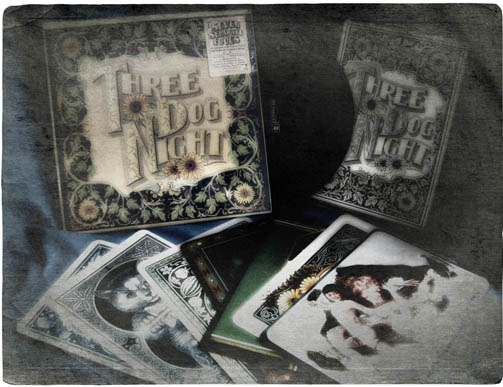
Now, Three Dog Night’s Seven Separate Fools (Dunhill DSD 50118) -- there’s an album package for you. It certainly gets my vote as one of the top ten record cover designs ever, and because I also have the CD version I can tell you that it doesn’t translate and they didn’t even try.
The album is designed to resemble a giant pack of playing cards, and inside of it the lucky buyer would find seven huge cards, one for each member of the band. Each photograph on the card faces is like a work of art in itself, putting forward something of that band member’s personality. Chuck Negron is depicted as a southern gentleman, Danny Hutton is the Joker of the deck, percussionist Floyd Sneed is a gambler in a red bowler hat raking in his winnings. Bassist Joe Schermie is shown in a more sinister light, stepping out of an Iron Maiden. The card backs are actual scans of vintage decks ranging in style from erotic to fanciful. The sleeve of the record identifies each of the band members by showing the backs of the cards fanned out, and attaching a name to each one. The back cover is taken up with another great photo of the cards all spread out on an oriental rug, with a rather forlorn pooch sitting at the top of the arrangement looking out at us.
The art director, photographer and designer each get a special credit on the sleeve, and they deserve it.
All of this would just be nice if the album itself wasn’t amazing. The album opens with their classic “Black and White” and never looks back. This is Three Dog Night at their best -- it’s a great Holistic package because you know just by looking at it that the album is going to be something special -- and the band does not disappoint.
Dunhill may have employed some of the most venturesome designers out there. It was Dunhill that issued The Papas and The Mamas -- a record that looks much better than it plays, on which playful listeners could mix and match The Mamas and The Papas faces by flipping the slatted cover.
Unfortunately, the group was in the process of falling apart when they recorded this one, and barring only Mama Cass’s solo on “Dream a Little Dream of Me” it isn’t nearly as much fun to listen to as it is to play with.
Another one of my top ten favorite record designs is the one Alan Aldridge and David Larkham did for Elton John’s Captain Fantastic and the Brown Dirt Cowboy. Two profusely illustrated booklets depict Elton’s rise to fame and his partnership with Bernie Taupin, told in a style of art approaching that of Hieronyus Bosch. Work like that helps to make a record album more than a collection of songs, but a thematic experience. It’s one of Elton’s most complex albums requiring several listenings to be fully appreciated, and the design helps to make it into a journey.
With CD packaging (and to an even greater extent digital downloads), I think the musicians are largely on their own. Maybe that’s the way it should be; maybe they prefer it that way. But for me the purpose of good design is to aid the artists in telling their story; so that when you slide it out of the bin you get the sense that there’s a real person in there, speaking to you.
Those days are over. I miss the golden age of record album design -- and it’s one of those things that we can never get back.
-- Freder
www.ducksoup.me
Love that Tom Rush album, but agree that the cover design was weak. I didn't really care because he was a hot looking guitar man!
ReplyDelete